Work About Resume Contact
Overview Problem Research Insights Design Process Decisions Solution Impact Reflection

Accessibility · EdTech · Inclusive Design

Saksham

Designing inclusive education for every learner: an accessible learning platform for neurodivergent students in India. Published on Cal Poly's Digital Commons and featured in Cal Poly's TAGA 2026 Journal.

My Role
UX Designer & Researcher
Type
Research Paper & Proposed Design
Timeline
2024 – 2025
Tools
Figma · Illustrator · UX Research
Project Resources
DOC
Research Paper
Cal Poly TAGA Journal 2026
Too excited? Skip to the prototype →
Role
Researcher & Designer
(Solo)
Timeline
2024 – 2025
Cal Poly
Team
Solo
Faculty advisor
Tools
Figma, qualitative
research methods

Introduction

Designing for neurodiversity in
Indian education.

During an interview for this project, an educator in India told me something I couldn't stop thinking about: "I have 40 students and no tools. I know some of them learn differently, but all I can do is teach the same way and hope for the best." That sentence became the emotional foundation for everything I designed.

My role: Sole designer and researcher. I independently drove every phase of this project: research strategy, user interviews, interaction design, high-fidelity prototyping, and usability testing. I also authored the published research paper (TAGA Journal 2026).

In India, over 5 million children with learning disabilities like dyslexia, ADHD, and autism face a system that wasn't built for them. Tools don't adapt to their cognition, interfaces overwhelm instead of support, and stigma means many go undiagnosed entirely.

Problem Statement

How might we create an experience that adapts to each learner's cognitive style?

I audited the tools these students actually use: Byju's, Duolingo, and government e-learning apps. Not a single major platform in India offered cognitive adaptation for neurodiverse learners. The apps were designed for a "default" student: fast-paced, visually dense, text-heavy. For a child with dyslexia, these interfaces don't just fail to help; they create anxiety.

The challenge became clear: design an educational experience that adapts to each learner's cognitive style, while promoting independence and confidence, not just learning outcomes.

🧠
Visual Overload
Many apps use overstimulating visuals that can overwhelm students with ADHD or autism, making focused learning nearly impossible.
⚙️
Lack of Personalization
Few platforms offer adaptive learning paths or adjustable reading modes, forcing a one-size-fits-all approach to diverse cognitive needs.
🌐
Language Barriers
Educational tools often exclude regional languages, alienating rural students and limiting access to millions across India.
💛
Need for Empathy
Inclusive design is not just about usability; it's about emotional safety and representation in every interaction.

Research

The research that changed
what I thought I was designing.

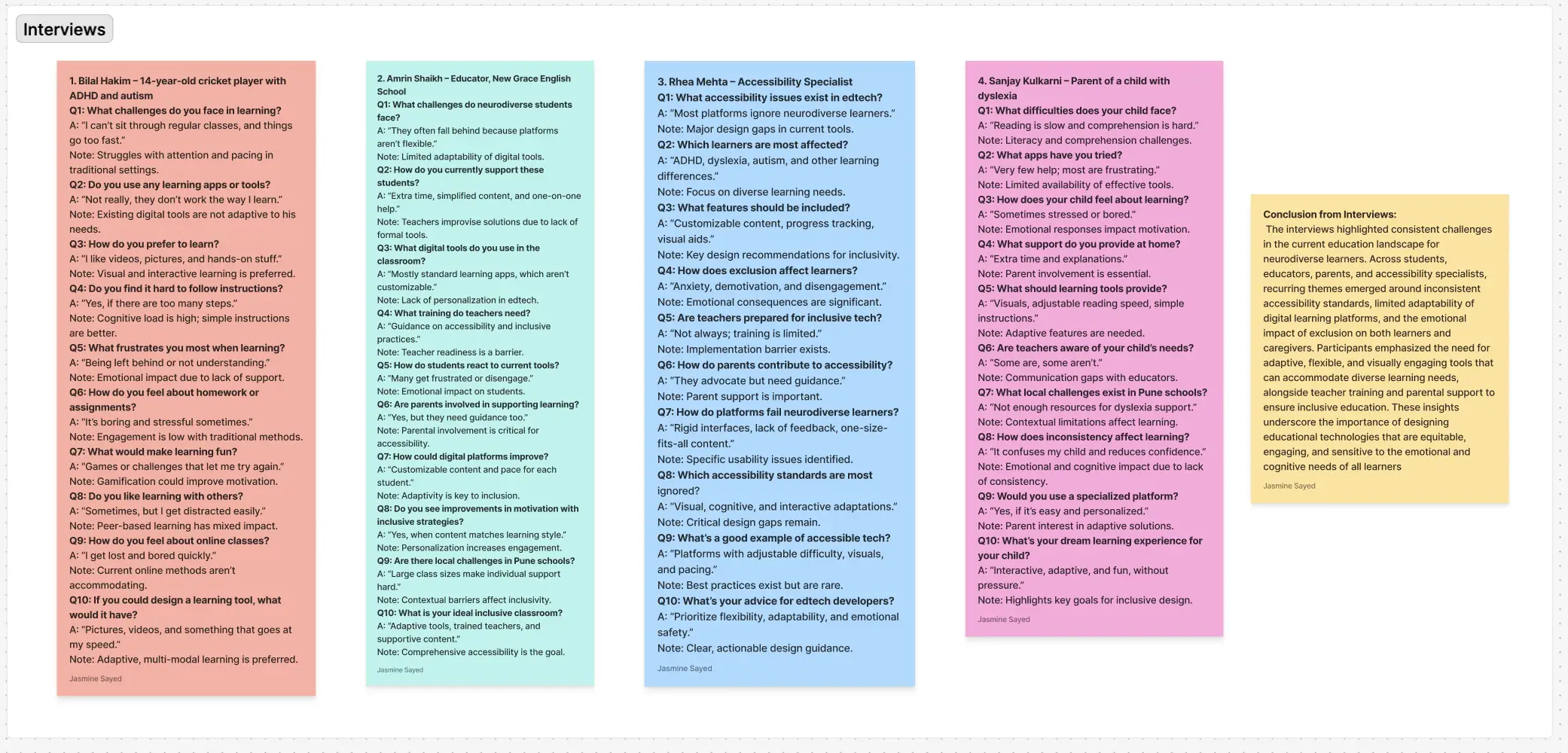
I went in thinking I was designing a learning app. After interviewing educators, parents, and accessibility experts, I realized I was designing a way for children to feel capable. Every parent described the same pattern: their child wasn't struggling with the content. They were struggling with the interface.

🎙️
Qualitative Interviews
In-depth conversations with educators, parents of neurodiverse children, and accessibility experts to understand real-world challenges in Indian classrooms.
📖
Literature Review
Academic research on accessibility, cognitive load theory, and inclusive design principles in educational technology contexts.
🔍
Comparative Analysis
Evaluated existing edtech tools including Byju's, Duolingo, and Microsoft Learning Tools, identifying critical gaps in accessibility features.

Meet the Users

I created personas based on real interviews to ground every design decision in human experience.

Bilal · 14 years old · Student with Dyslexia & ADHD

"Reading feels impossible sometimes. The words blur together, and I can't keep up with everyone else. I wish learning could work the way my brain does."

Meera · Educator · Inclusive Classroom Teacher

"I want to support every student, but I have 40 kids and no tools designed for differentiated instruction. I'm constantly improvising."

Published Research

This research culminated in my paper, "Designing for Neurodiversity: Accessibility in Educational Technology for India's Future Learners," published on Cal Poly's Digital Commons and in Cal Poly's TAGA 2026 Journal.

Key Insights

Four findings that reshaped
my entire approach.

01
"The colors and animations make my son shut down."
A parent of a child with autism described how popular learning apps triggered sensory overload within minutes. This wasn't about preference; it was about access. I committed to visual simplicity as a non-negotiable design principle, not a nice-to-have.
02
One modality isn't enough
Literature on cognitive load theory confirmed what educators told me: students with dyslexia retain significantly more when audio reinforces visual content. This drove the guided reading mode (synchronized narration with text highlighting) as a core feature, not an add-on.
03
Control transforms anxiety into confidence
Every educator I spoke with emphasized the same thing: when students can adjust their own reading speed, font type, and color contrast, they stop feeling like the app is working against them. Customization isn't a feature; it's the difference between a child who gives up and one who tries again.
04
Comparison kills motivation
Parents described how timed exercises and leaderboards in apps like Byju's made their children feel "stupid." Self-paced progress with private, celebratory milestones emerged as critical, letting each child compete only with their own previous performance.
Insights synthesis: connecting research findings to design opportunities
Research insights synthesis showing key findings from user interviews and literature review

Design Process

From empathy to
interactive prototype.

I initially tried to build an AI-powered emotion tracker, but testing revealed this felt invasive. Parents said, "I don't want an app watching my child's face." That feedback forced me to pivot to proactive customization: let the student control their environment before frustration ever starts.

1
Empathize
Created personas based on real interviews, including Bilal, a 14-year-old student with dyslexia and ADHD, and Meera, a teacher struggling to differentiate instruction for neurodiverse classrooms. Their stories grounded every design decision.
2
Define
The goal: design a learning experience that uses visual simplicity to minimize cognitive load, integrates multi-sensory learning (audio, visual, tactile), provides customization for reading speed, font type, and color contrast, and encourages self-paced progress with gamified motivation.
3
Ideate
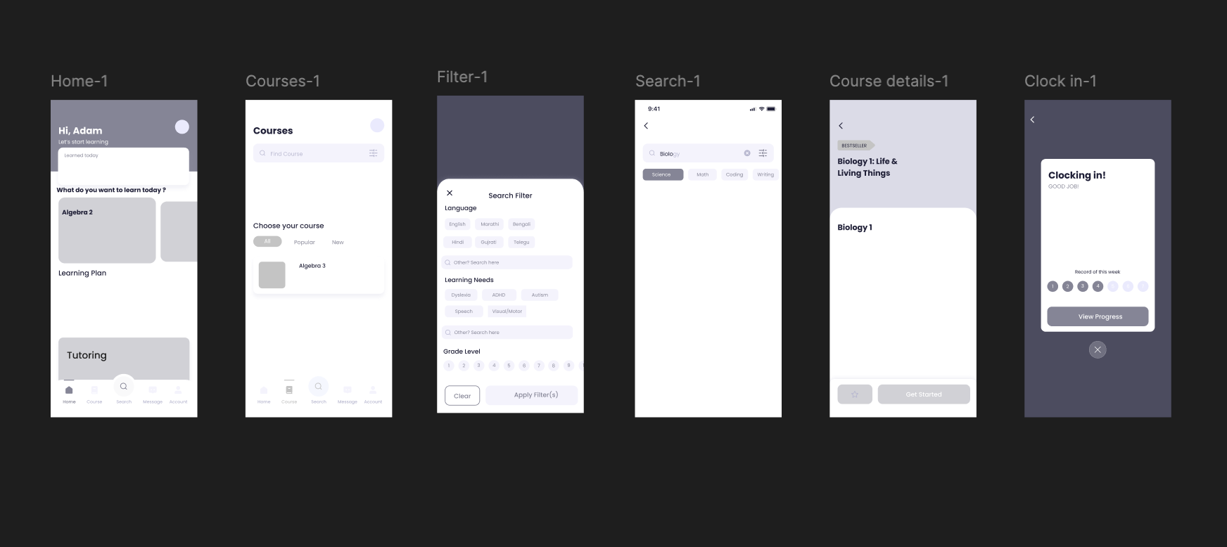
Brainstormed design ideas using mind maps and low-fidelity wireframes in Figma. Concepts explored: a voice-guided reading assistant, emotion-based feedback tracking to identify when learners feel overwhelmed, and a reward system for progress to foster confidence.
Low-fidelity wireframes: early layout explorations for the mobile learning app
Low-fidelity wireframes showing early layout explorations for the Saksham app
4
Prototype
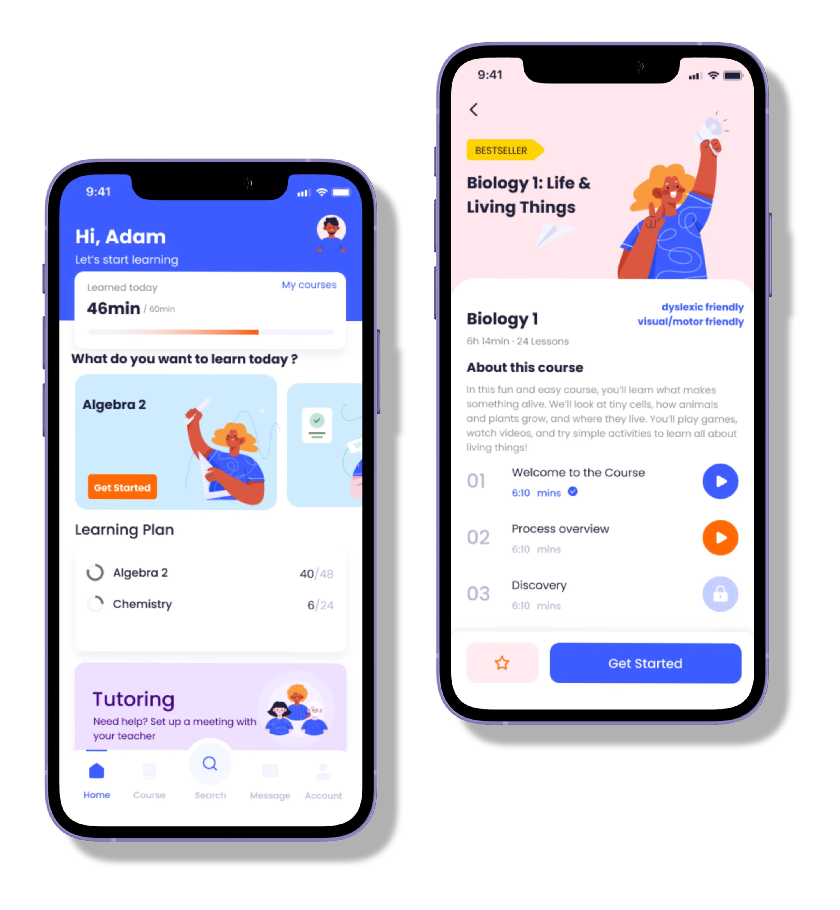
Built interactive wireframes in Figma for a mobile app. Features included a customizable dashboard (preferred colors, fonts like OpenDyslexic typeface), a guided reading mode with audio narration and text highlighting, and offline functionality for low-connectivity regions.
5
Test
User testing with educators and parents of children with dyslexia and ADHD led to key refinements: simplified navigation for easier task completion, added voice cues for non-readers, and reduced visual motion to prevent overstimulation.

Design Decisions

Three choices I had to defend
against my own instincts.

Each one was a moment where the obvious move turned out to be wrong, usually because educators and parents pushed back on assumptions I hadn't realized I was making.

01

Emotion-tracking AI, or proactive customization?

My first concept was an AI that watched the child's face and adapted to detected frustration. Parents recoiled: "I don't want an app watching my child's face." I cut the tracker and replaced it with upfront customization, letting students set reading speed, font, contrast, and motion themselves, with no algorithm in the loop.

No flashy AI hook. Accepted because the more "intelligent" the system tried to be, the less control the child had, and control was the entire point.

02

Calm, or clinical?

My first prototype took "visual simplicity" literally: stripped color, minimal illustration. An educator told me it felt clinical. I rebuilt around warm, high-saturation accents on a calm base. Joy lives in color and character; calm lives in motion and density.

More illustration debt than a minimalist version. Worth it. The goal wasn't to look accessible; it was to feel inviting to a kid who's been told they're behind.

03

Customization as feature, or as foundation?

Most educational apps bury customization in a settings menu. Educators kept describing the same moment: when a neurodivergent child realized they could change the app's pace, font, or color, their relationship to the tool flipped. I moved customization into onboarding as the first interaction: font (including OpenDyslexic), pace, and color world chosen before any content loads.

Slower time-to-first-lesson, and an upfront ask from a child whose attention may already be fragile. Mitigated with playful micro-interactions and a "skip to defaults" path.

Design System

A visual language built for
accessibility.

Warm, high-contrast colors and a friendly typeface chosen to reduce cognitive load, making every screen feel inviting and easy to navigate for neurodiverse learners.

#3D5CFF
#8699FF
#FF7C24
#FFD301
#EFE0FF
#FFE7EE
Heading Heading
Subheading Subheading
Body Body

Solution

Introducing Saksham.

"Saksham" means "capable" in Hindi, and that's the feeling this app is designed to create. Every feature traces back to a specific research finding: the customizable dashboard exists because parents said their children shut down when they can't control their environment. The guided reading mode exists because educators told me audio reinforcement was the single most effective intervention they'd seen. The offline functionality exists because 60% of India's rural students lack reliable internet. Nothing is decorative; every decision has a reason.

🎨
Customizable Dashboard
Learners select preferred colors, fonts (including OpenDyslexic), and layout, making the interface truly their own.
🔊
Guided Reading Mode
Audio narration with synchronized text highlighting supports reading comprehension across ability levels.
📴
Offline Functionality
Full learning access without internet, critical for low-connectivity regions across rural India.
🏆
Gamified Progress
Self-paced rewards and milestone celebrations build confidence and sustain motivation over time.
👩‍🏫
Teacher Dashboard
Provides educators with real-time insights into student progress, enabling individualized support at scale.
🗣️
Voice Cues for Non-Readers
Audio guidance throughout the interface ensures students who can't yet read can still navigate and learn independently.

Impact

From a personal project to
published research.

What started as a passion project became something larger. The research paper was accepted for publication because it demonstrated a rigorous, human-centered framework for designing accessible educational technology in a context where very little exists.

Published
on Cal Poly's Digital Commons and in Cal Poly's TAGA 2026 Journal, recognizing its contribution to inclusive design
5M+
neurodivergent students in India underserved by current learning tools: the problem scale this research addresses
Catalyst
for discussions among Indian educators and nonprofits about scalable inclusive education tools

"I was really interested in your project that was listed on the GRC database."

TAGA Journal Editor · Technical Association of the Graphic Arts

Reflection & Next Steps

What I got wrong,
what I'd change.

My biggest blind spot was assuming I could design for neurodivergent children without involving them directly. Ethical constraints made it difficult to include minors, so I relied on parents and educators as proxies. The designs are stronger for it, but there's a real gap between what adults report and what children experience. Participatory design with children is the essential next step.

This project changed how I think about design itself. Accessibility isn't a feature you add at the end; it's a lens that shapes every decision from the start. The journey from a personal question to published research made me a fundamentally more thoughtful designer on every project since.

Looking Ahead

🤝
NGO Collaboration
Partner with Indian NGOs to develop a pilot version of Saksham for real classrooms.
🤖
AI-Driven Personalization
Integrate AI for real-time learning support, adapting content difficulty and presentation based on individual progress.
🌍
Cross-Cultural Research
Expand research on cross-cultural inclusivity in educational UX beyond the Indian context.
Next Project
Nexstera Tech: Redesigning for Climate Impact
View case study →