
Work About Resume Contact
Overview Problem Research Insights Design Process Decisions Solution Impact Reflection

UX Design · Website Redesign · Climate Tech

Nexstera
Tech

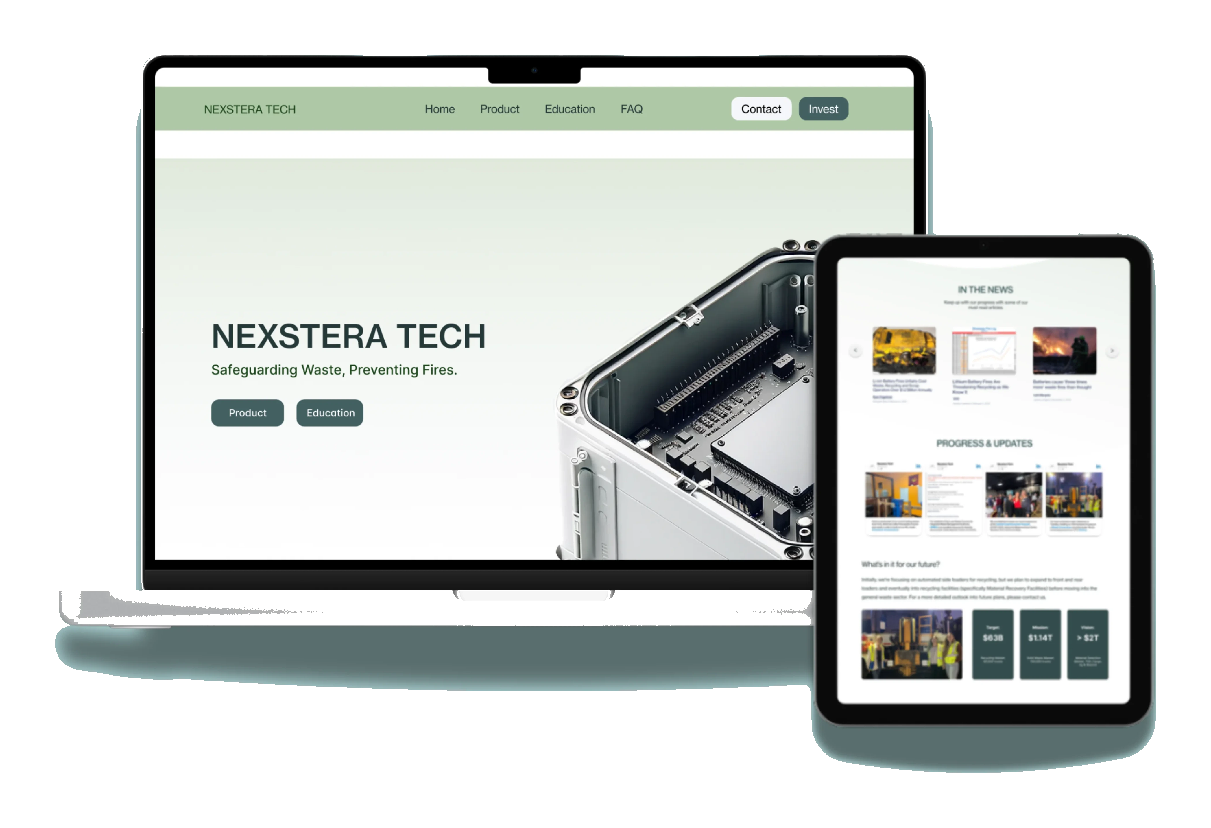
Designed a website for a lithium-ion battery AI startup. Following the redesign, the team secured $65K in seed funding and saw a 120% increase in investor engagement.

My Role
UX Designer
Team
5 designers · 2 PMs · Founding team
Timeline
Jan – Mar 2024 (8 weeks)
Tools
Figma · Illustrator · Miro
Too excited? Skip to the prototype →
Role
UX Designer
(Solo)
Timeline
8 weeks
Jan – Mar 2024
Team
Climate-tech
founding team
Tools
Figma, Webflow,
FigJam

Introduction

How might we build investor trust while educating the public about battery safety?

Every year, lithium-ion batteries hiding in waste streams cause hundreds of facility fires, costing millions. Nexstera Tech built Pyrotack, an AI system that detects these batteries before they ignite. The technology worked. But nobody outside the founding team understood why it mattered.

My role: UX designer. Owned the Investor and Education pages end-to-end: competitive analysis, journey mapping, wireframing, visual design, prototyping, and usability testing.

Their website read like an engineering spec sheet: dense, unfocused, and missing the human stakes. No investor page, no educational content, no reason for a first-time visitor to care. For a startup that needed funding to survive, this was an existential gap.

Following the redesign, Nexstera secured $65,000 in seed funding and saw a 120% increase in investor engagement. The founding team attributed the improved investor interest to the clarity of the redesigned platform.

Problem Identification

A brilliant product
nobody could explain.

Nexstera had real technology solving a real problem, but their digital presence worked against them. I tried to answer one question: "If I were an investor landing here for the first time, would I understand what this company does within 30 seconds?" The answer was no.

The site buried its value proposition under jargon, had no investor pathway, and offered nothing to educate visitors about why battery fires matter. Three critical gaps stood out:

01
No Investor Resources
The site had no dedicated investor page, making it difficult to showcase traction, business value, and funding potential to prospective backers.
02
Missing Educational Content
Lithium-ion battery technology is widely misunderstood, yet the site offered little educational material to inform users and build credibility.
03
Weak Design Foundation
Inconsistent design, poor hierarchy, and limited polish reduced brand credibility and user confidence in the platform.

User Research

I assumed investors wanted data.
They actually wanted a story.

My initial hypothesis: investors want metrics, traction data, and technical proof. But journey mapping and think-aloud sessions revealed something unexpected. Investors dropped off not because they lacked information, but because they couldn't find a reason to care. The emotional hook was missing. This shifted my approach from "present data clearly" to "tell a story that makes data meaningful."

🗺️
Journey Mapping
Mapped the end-to-end journeys of two distinct users: an investor and a curious visitor, to identify friction points and emotional gaps at each stage.
🔍
Competitive & Market Analysis
Analyzed 6 competitors in the battery and sustainability space to understand effective layout, tone, and content patterns across the industry.
📐
UX & Content Audit
Conducted a full audit of Nexstera's existing web content and user flow to identify areas for simplification, clarity, and credibility improvement.
Journey map: dual-track mapping of the investor and curious visitor experience across five stages
Stage 1Awareness
Actions
Arrives on homepage of websiteInvestor
Arrives on homepage of websiteVisitor
Pain Points
No details for investors on homepage, only general product infoInvestor
Shallow overview with few visuals and no direction for consumersVisitor
Opportunities
Create a dedicated investor pageInvestor
Build an educational landing page with step-by-step visualsVisitor
Stage 2Consideration
Actions
Clicks "get in touch" to ask questionsInvestor
Clicks "get in touch" or joins email listVisitor
Pain Points
Information gated behind contact form with no assurance of replyInvestor
Little info about the problem's significance or what to do with old batteriesVisitor
Opportunities
Add straightforward contact with reply assurance and visible investor tabInvestor
Educate on battery types and drop-off instructions for recyclingVisitor
Stage 3Acquisition
Actions
Gets in contact to begin investment processInvestor
Learns what to do with batteries, reaches out or joins mailing listVisitor
Pain Points
Meeting setup feels like a guessing game, not straightforwardInvestor
No clear path for individual action like battery drop-off locationsVisitor
Opportunities
Use direct CTAs like "set up meeting" with specific investor infoInvestor
Visual guide showing which devices have lithium batteries and where to drop offVisitor
Stage 4Service
Actions
Invests in productInvestor
Becomes more educated on batteriesVisitor
Pain Points
Investors can't easily market or share with others, limited info and graphicsInvestor
After learning and taking action, unclear what comes nextVisitor
Opportunities
Prioritize impressive product features and stats in investor sectionInvestor
Add social sharing tools like infographics to encourage spreading the wordVisitor
Stage 5Loyalty
Actions
Continues investingInvestor
Continues taking action and sharing progressVisitor
Pain Points
No mechanism to build long-term investor loyaltyInvestor
No reason to return to the site after initial learningVisitor
Opportunities
Regular updates with stats and progress reportsInvestor
Progress tracker that motivates continued engagement, plus educational contentVisitor
Actions
Pain Points
Opportunities
Think-aloud study: annotated markup highlighting usability issues and user confusion points
Think-aloud study markup showing annotated user feedback on the original site

Competitive Landscape

I analyzed 6 companies in the battery and sustainability space to understand what effective digital presence looks like in this sector.

Nuvola Tech
SafeCoat™ DDS spray-on battery separator improving safety, energy density, and manufacturing efficiency.
Li-ion Tamer
Off-gas monitoring to prevent thermal runaway: offering up to 30 minutes of early warning for battery fires.
Li-Cycle
Battery recycling provider collecting and processing lithium-ion batteries to recover materials and support safer disposal.
Battery Recyclers of America
Canadian recycler active in the U.S., recovering 95%+ of materials from spent lithium batteries using shredding and chemical leaching.
InfraTec
Industrial infrared systems for battery production: improving manufacturing efficiency rather than end-of-life safety.
Redwood Materials
Founded by former Tesla CTO JB Straubel, this is a major lithium-ion recycling and materials supply recovering critical metals from end-of-life batteries.

Key Opportunities from the Audit

Content
Make the site more engaging and credible: simplify text, add personality and visuals, and highlight media coverage to build social proof.
Structure
Improve navigation with clear actions, dedicated pages for battery types, step-by-step processes, FAQs, and intuitive dropdown menus.
Design
Adopt minimalistic layouts with purposeful visuals and videos to clearly communicate product functionality without overwhelming users.

Key Insights

Three findings that changed
the direction of this project.

01
"I get that it's important, but I don't feel it."
During think-aloud sessions, participants could summarize Pyrotack's function, but none could articulate why it mattered to them personally. The site informed without persuading. This insight drove me to lead with human stories of facility fires rather than technical specs.
02
Investors bounced in under 15 seconds
Journey mapping revealed that investors arriving at Nexstera's homepage had no clear next step: no dedicated page, no traction metrics, no pathway to a conversation. They needed a curated experience that spoke directly to their decision-making process.
03
Competitors looked more legitimate (even when they weren't)
Redwood Materials and Li-Cycle had polished, story-driven sites that projected authority; even when their technology was less advanced than Nexstera's, visual credibility was acting as a proxy for product credibility in investors' minds.

Design Process

The first version was wrong.
That's how I knew it was working.

My initial wireframes tried to do too much: cramming investor data, educational content, and product details onto a single page. During a workshop, the CEO pointed out we were recreating the exact problem we'd identified: information overload with no clear journey. I separated the experience into distinct pages, each with a single purpose and a clear next step.

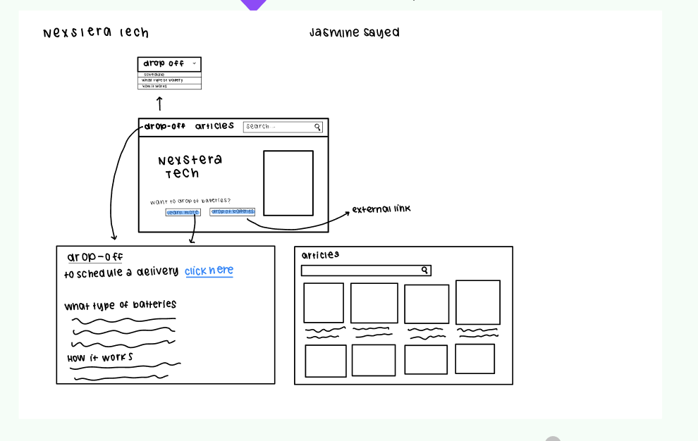
Initial sketches exploring layout concepts
Early concept sketch exploring layout and information hierarchy
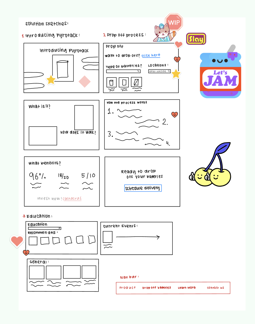
Refined sketches iterating on page structure
Refined sketch iterations for key pages
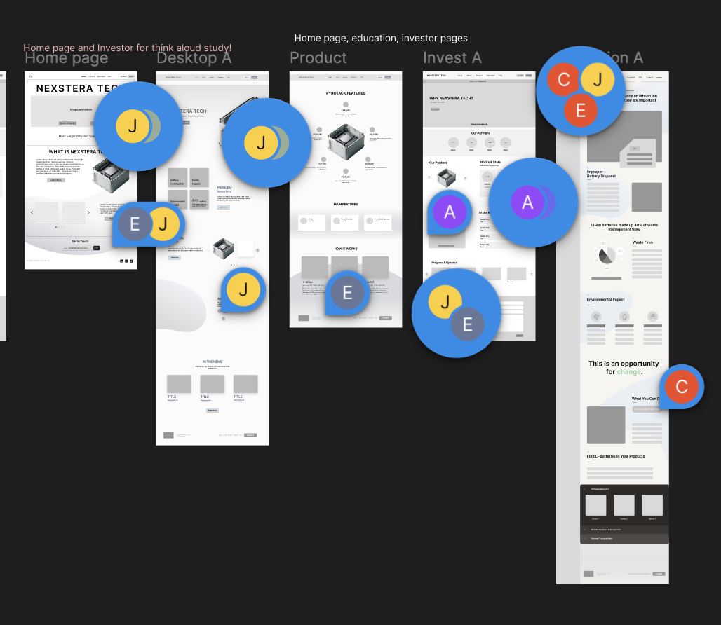
Mid-fidelity wireframes: translating sketches into structured Figma layouts
Mid-fidelity wireframes showing page layouts in Figma

Design Decisions

Three trade-offs that shaped
the redesign.

Most of the design work was straightforward. These three were the moments where two defensible directions pointed in opposite ways, and the choice mattered more than the polish.

01

One page for everyone, or separate journeys?

My first wireframes crammed investor metrics, education content, and product detail onto one homepage. In a workshop review, the CEO pointed out I was recreating the exact problem we'd identified: information overload, no clear path through. I split the experience into dedicated pages, each with one job, one audience, one next step.

More pages to design, build, and maintain. Accepted because consolidation is only efficient when audiences want the same things, and ours fundamentally didn't.

02

Data-first, or story-first?

My hypothesis was that investors want the receipts: traction, market sizing, technical proof. Think-aloud sessions said otherwise. Participants could explain Pyrotack but couldn't articulate why it mattered enough to write a check. The data wasn't the missing piece. The emotional hook was. I rebuilt the investor page to lead with stakes, then product, then numbers.

Investors who wanted to skim to traction had to scroll further. Mitigated with a sticky nav, but the default flow now made you feel the problem before you saw the metrics.

03

Borrow legitimacy, or build from scratch?

Redwood Materials and Li-Cycle had more polished sites than Nexstera, even though Nexstera's tech was stronger. Visual credibility was acting as a proxy for product credibility. A startup raising seed money doesn't have the budget to teach investors a new visual vocabulary. I adopted the category's established conventions (cool green palette, calm type, hero video) and let the substance do the differentiation.

Less visual originality. The right call: the redesign secured $65K in seed funding within months. Ambition can come in V2.

Design System

Building a consistent
visual language.

A modular system of colors and typography grounded in Nexstera's sustainability mission: ensuring visual consistency across every page and component.

#436062
#1A461A
#E2EFDD
#253839
#AFC6A6
Heading Heading
Subheading Subheading
Body Body

Solution

Introducing Nexstera Tech's
new website.

Each page now has a single job: the homepage builds emotional urgency, the investor page converts interest into meetings, and the education hub positions Nexstera as a thought leader. Every decision traces back to research.

💰
Dedicated Investor Page
Clearly presents traction, Pyrotack's value, and business potential: designed specifically to support funding conversations and investor outreach.
📚
Educational Content Hub
Simplifies technical concepts about lithium-ion battery risks and Pyrotack's AI detection: building public awareness and credibility.
📖
Streamlined Product Storytelling
Translates Pyrotack's complex technical functionality into accessible, engaging narratives that any visitor can understand.
🧩
Modular, Scalable Design System
A cool green palette reflecting sustainability and innovation: ensuring visual consistency and long-term adaptability as Nexstera grows.
Clear Calls to Action
Intentional engagement pathways that drive user flow from initial awareness through inquiry and conversion for both investors and the public.

"Penny and the Nexstera Tech team were incredibly excited to have a clean, professional website for the startup, describing its implementation as a monumental step in helping bring in investors and worldwide interest."

Iter8 Design Team · Cal Poly San Luis Obispo

Impact

From "what does this company do?" to $65K in seed funding.

The redesign fundamentally changed how people experienced Nexstera's story. Investors who previously bounced were now exploring the dedicated investor page, reaching out for meetings, and investing. The founding team described it as a shift from explaining their product to having the website do it for them.

$65K
secured in investment funding directly supported by the redesigned investor page
120%
increase in page interactions and engagement following the website launch
40%
reduction in navigation friction through cleaner storytelling and intuitive structure

Reflection

What I'd do differently
& what stays with me.

If I could restart this project, I'd push harder for direct investor interviews early on. My journey maps were built from competitive analysis and think-aloud sessions with proxy users, but nothing replaces hearing an actual investor say "this is where I'd leave the page." I also underestimated how long design system work would take; building consistent components across five pages meant front-loading effort that paid off massively in the final sprint.

The biggest lesson: design for startups isn't just about usability; it's about survival. Every decision either moved Nexstera closer to funding or further away. The founding team described the launch as a "monumental step toward attracting investors and global interest." Knowing my work contributed to that remains one of the most meaningful outcomes of my career.

Next: transitioning the design into a live Webflow site. Given more time, I'd A/B test the investor page's CTA placement and run usability sessions with real investors, closing the one gap in my research approach.

Next Project
Saksham: Inclusive Learning for All
View case study →