Work About Resume Contact
Overview Problem Research Insights Design Process Decisions Solution Reflection

Product Design · Identity · Mobile App

Nox+

A secure, universal identity verification platform designed to give users control, transparency, and trust across digital and physical environments.

My Role
Project Lead
Team
1 lead · 1 researcher · 2 designers
Timeline
Sep – Dec 2025
Tools
Figma · Illustrator · Qualtrics

Product demo

Too excited? Skip to the prototype →
Role
Lead Designer
& Researcher
Timeline
10 weeks
2025
Team
4-person
cross-functional
Tools
Figma, FigJam,
Maze

Introduction

How can we simplify identity
verification for college students?

64% of our survey respondents had experienced or knew someone affected by identity theft related to verification. This wasn't an abstract security problem. Students were anxious every time they uploaded a passport to another portal. The tools they used offered zero transparency about where that data went.

My role: Project lead on a 4-person team. I drove survey research (n=96), led interviews with students affected by data breaches, ran competitive analysis, created personas, and iterated from sketches through high-fidelity prototype in Figma.

Problem Identification

Meet Pam.

She's a graduate student verifying her identity for yet another online portal. Before uploading her documents, she hesitates, unsure where her data will go or who can access it.

Pam · Graduate Student · University of Washington

"I've uploaded my passport to so many different portals. I never know who actually sees it or how it's stored. Every new system feels like a privacy risk."

For students like Pam, identity verification is fragmented and unclear. Multiple logins, inconsistent requirements, and vague privacy policies create stress and erode trust. Users feel exposed rather than protected.

User Research

The data confirmed the anxiety.
The interviews revealed why.

The survey showed the stats: 57% experienced frequent upload errors, 34% didn't know which documents were required. But interviews revealed the emotional core. Students felt learned helplessness: burned so many times they'd stopped trusting any system. One told me, "I just assume every portal is going to leak my data eventually." That distrust became the problem Nox+ was designed to solve.

📋
Survey
21-question survey covering document management habits, verification challenges, privacy confidence, and experiences with identity theft.
n = 96
🎙️
Semi-structured Interviews
Focused on participants who experienced data breaches. Explored emotional impact and behavioral patterns around verification trust.
n = 16
👁️
Contextual Inquiries
Observed how participants secure identity documents on Google Drive and protect online accounts through Duo Security in real time.
n = 2 sessions
34%
of respondents were unsure which documents were required during verification
64%
have personally experienced or know someone affected by identity theft related to verification
57%
experienced frequent upload errors when trying to verify their identity online

Key Insights

What users
actually need.

After synthesizing 96 survey responses, 16 interviews, and 2 contextual inquiry sessions, two core insights reframed the entire problem.

01
"Why do I have to prove who I am 12 different ways?"
Students weren't just frustrated by bad UX; they were frustrated by fragmentation. Every new platform required re-uploading the same documents with different requirements and different interfaces. They cited Duo Security as a benchmark for what "simple and reliable" looks like. The insight: we didn't need a better verification form. We needed a single source of truth.
02
Security that's invisible feels like no security at all
During contextual inquiries, I watched participants store passport scans in Google Drive with no encryption and no access controls because "at least I can see it there." They didn't trust black-box security. They needed visible proof: lock icons, confirmation messages, audit trails of who accessed what and when. Trust had to be performed, not just promised.

Design Process

We designed three versions
before we got it right.

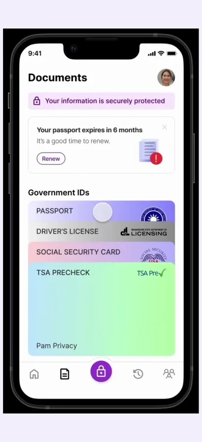
Early sketches treated Nox+ as a document vault: upload, store, retrieve. But critiques revealed that storage alone didn't solve the trust problem. The second iteration added transparency panels (who accessed your data, when, why), which tested better but felt overwhelming. The breakthrough came when I reorganized around moments of verification rather than document management: the app surfaces exactly what you need, when you need it, with clear security signals at every step.

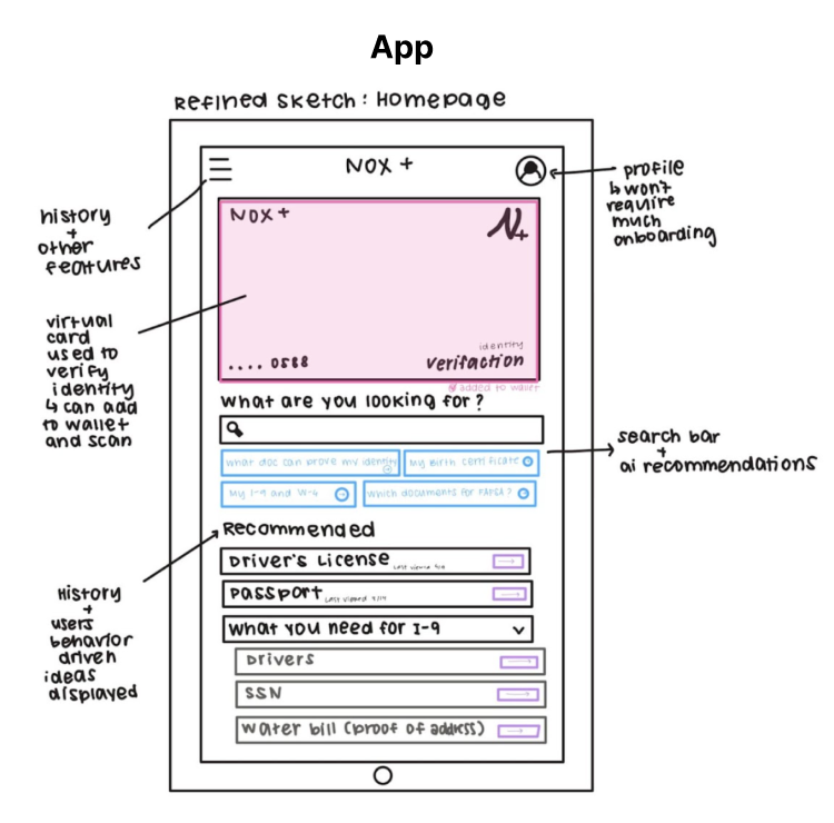
Sketching: exploring feature ideas, screen flows, and layout before moving to digital
Early concept sketches exploring Nox+ app features and layout

Wireframes

I delegated screen assignments across the team while maintaining consistency through regular critiques. One key decision: I chose to show redacted document previews (blurred details with only relevant fields visible) instead of full documents, directly addressing the finding that users felt exposed when their full passport was displayed on-screen.

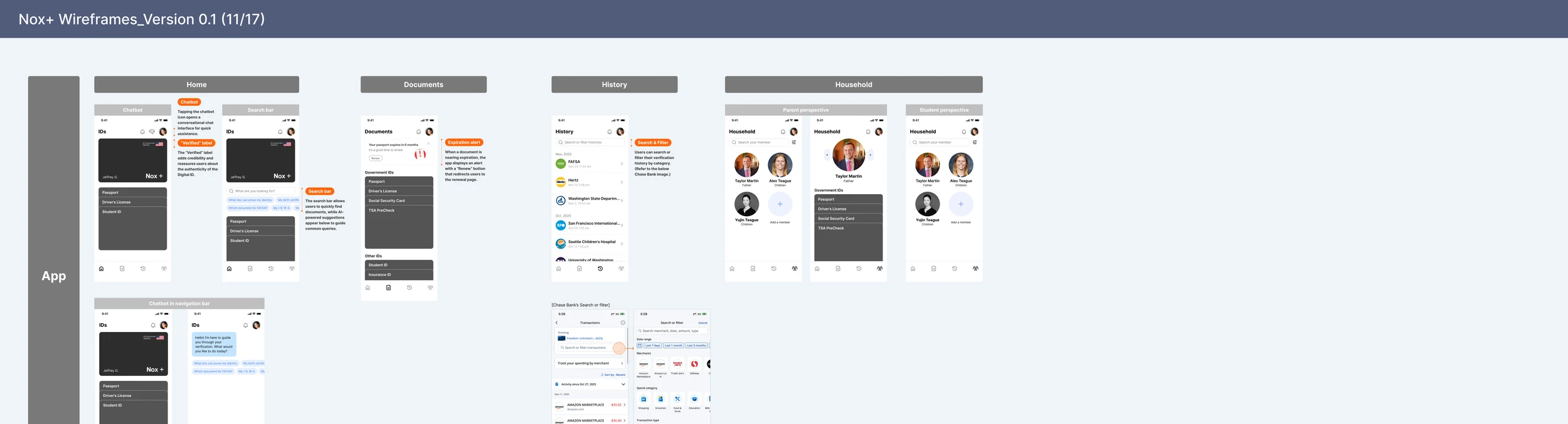
Mid-fi to hi-fi: evolving wireframes into polished, interaction-ready screens
Mid-fidelity and high-fidelity Figma designs for Nox+

Design Decisions

Three choices that shaped
the final product.

Each was a moment where two reasonable approaches pointed in opposite directions. The framework gets you to a defensible answer; the decisions are where the trade-offs actually live.

01

Vault, or moment-of-verification?

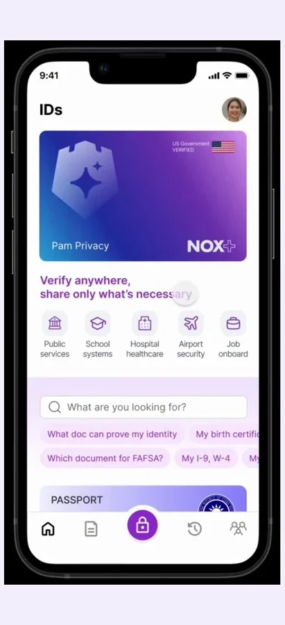
V1 framed Nox+ as a document vault: upload, store, retrieve. V2 added transparency panels showing who'd accessed each file. Storage alone didn't address the trust anxiety; transparency panels added cognitive load to a moment that should feel automatic. I reorganized around moments of verification: the home surfaces what's being asked for, with security signals visible at the moment of share. Storage moved to a secondary surface.

Lost a clean "manage everything from one screen" hierarchy. Accepted because the research described identity as reactive, not planned.
02

Full document, or redacted preview?

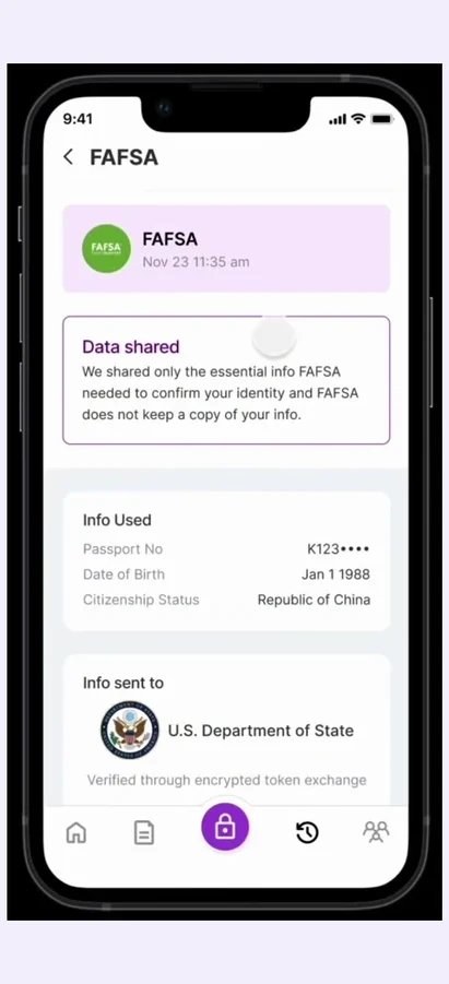
Research kept surfacing the same finding: users felt exposed when their full passport was displayed on-screen, even before sharing. The most accurate preview was also the one that triggered the anxiety we were trying to solve. I made redacted preview the default (only the requested field visible) with "show full" one tap away, controlled by the user.

An extra tap for at-a-glance confirmation. Accepted because the discomfort signal was stronger than the friction signal.

03

What I cut, and why.

An AI document scanner and a social verification network were strong pitches. Both expanded the trust surface area, exactly the thing Nox+ existed to shrink. I cut both for V1 and held the line at biometric setup, document management, the Nox+ card, transparency panels, and family controls.

Less differentiation in a pitch deck. But every cut feature would have diluted the core promise.

Design System

The visual language
behind Nox+.

A gradient-driven system built around trust, security, and modernity: from the vibrant app icon to every screen interaction.

#24C0E9
#2135AA
#794AB7
#F68DFF
#6A00B5
#333333
FUTURA
Logo & brand mark
Inter
Bold
Headings & titles
Inter
Medium
Labels & CTAs
Inter
Regular
Body text

Solution

Introducing Nox+.

Nox+ is built on a simple premise: people don't want to manage their identity; they want to forget about it until they need it. The app pairs a physical proof card with a mobile platform for seamless verification across digital and in-person contexts. Every feature answers the core question participants asked: "Who has my data, and can I trust them?"

Key Features

🔐
Biometric Verification
Quickly set up and verify identity using secure biometric authentication during onboarding.
📁
Document Management
Store identity documents securely with automated expiration alerts and renewal reminders.
💳
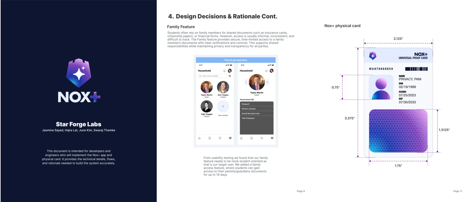
Universal Nox+ Card
A physical proof card that seamlessly verifies identity both online and offline.
🔍
Data Transparency Panels
See exactly what information is shared, with whom, and revoke access at any time.
👨‍👩‍👧
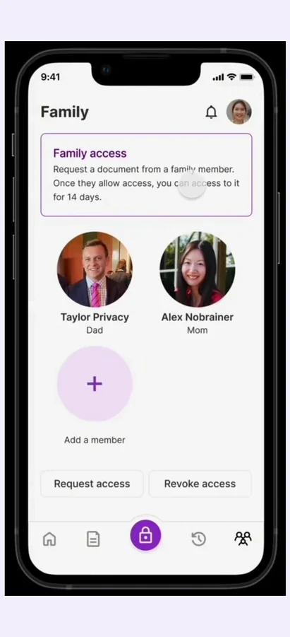
Family Access Controls
Grant or revoke access to family members with a simple, clear permissions system.
🤖
AI-Powered Guidance
Intelligent search helps users find required documents and verification steps instantly.

Interactive Prototype

See Nox+ in action.

A walkthrough of the Figma prototype demonstrating the complete user flow: from onboarding and biometric setup through document management and identity verification.

Prototype Walkthrough

"I had an amazing time working with you. Couldn't have asked for a better teammate."

Teammate · Designer, Nox+ Team

Reflection

What leading taught me
& what I'd do differently.

The hardest part of leading this wasn't the design itself. It was prioritization. With four people and 10 weeks, every yes to a feature was a no to two others. Saying no to good ideas, especially my own, was the work.

Apple's Digital ID launch in November 2025, while we were still building Nox+, confirmed that this problem space was real and that industry leaders were prioritizing it too. The same trust problem, surfacing in the largest consumer ecosystem in the world.

With more time, I'd push beyond students. Identity verification anxiety isn't unique to one demographic: immigrants, elderly people managing healthcare documents, and gig workers face similar fragmentation. Testing with those groups would reveal whether our trust-first framework holds across audiences.

Next Project
Saksham: Inclusive Learning for All
View case study →